Plotting Data
The sandbox includes tools for plotting Bulk Input/Output (BulkIO) data from components and devices. The built-in matplotlib plots support visualizing BulkIO data in the time and frequency domains, as well as constellations. The plots are fully integrated into the sandbox, support all numeric BulkIO data types, and may be used as the provides side for component connections.
The following example plots the data from a component as a line plot:
>>> plot = sb.LinePlot()
>>> my_comp.connect(plot)
>>> sb.start()
Before displaying data, plots must be started either by calling their start() method or by calling sb.start(). If the sandbox is already started when the plot is created, then the plot’s initial state is started.
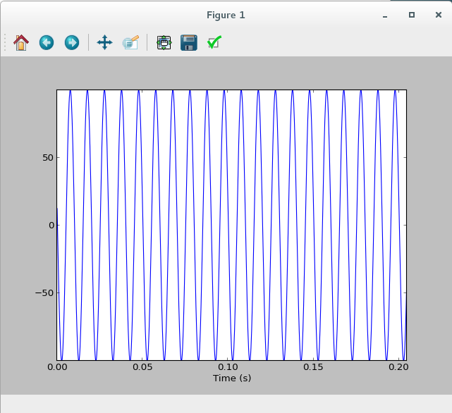
Example of LinePlot
Frame Size
By default, all the plots display 1024 input samples at a time. To override this default setting, set the frame size by using the frameSize argument:
>>> plot = sb.LinePlot(frameSize=8192)Larger frame sizes allow the plot to keep up with a higher rate of input data.
Fast Fourier Transform (FFT) Size
Plots that display the Power Spectral Density (PSD) of input data use a default FFT size of 1024 points. To increase the frequency resolution, set the nfft argument to a larger FFT size:
>>> plot = sb.LinePSD(nfft=8192)The frame size defaults to the FFT size, but can be overridden with frameSize. It may be smaller than the FFT size; however, it cannot exceed the FFT size. If the frame size is smaller than the FFT size, the data is zero-padded.
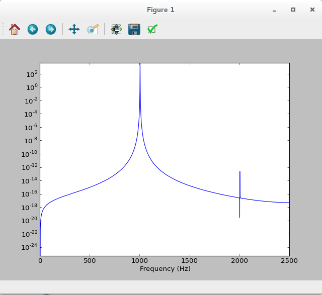
Example of LinePSD
Line Plots
Line plots display signal or PSD data as a series of colored line segments, similar to an oscilloscope display. Each input signal is represented by a different line color. A new trace is created for each connect() call, and traces may be added and removed dynamically.
All input signals must have the same sample rate or the sources may get out of sync.
The X range is based on the frame size and input Signal Related Information (SRI). By default, the Y range is determined automatically per-frame based on the input data. A fixed minimum and maximum may be set independently with the ymin and ymax attributes:
>>> plot.ymin, plot.ymax = (-2.5, 2.5)Automatic scaling can be re-enabled by setting ymin or ymax to None.
>>> plot.ymin = NoneThe LinePlot plot displays one or more input signals. Time and value are displayed on the X and Y axes, respectively.
The LinePSD plot displays the PSD of one or more input signals. The frequency is represented by the X axis, while the magnitude is represented by the Y axis using a logarithmic scale.
Raster Plots
Raster plots display signal or PSD data as a two-dimensional image. Each horizontal line represents one frame of data. This plot type is most useful for visualizing an input signal in the frequency domain over time.
All raster plots allow configuration of the image size at creation time. The default image size is 1024x1024; height and width can be overridden with the imageHeight and imageWidth arguments:
>>> plot = sb.RasterPSD(imageHeight=512, imageWidth=768)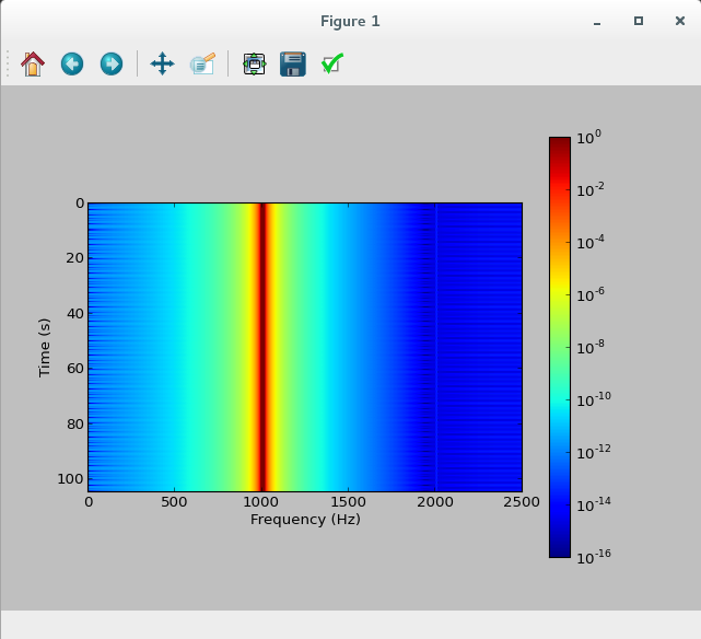
Example of RasterPSD
The plot X and Y ranges are fixed based on the FFT or frame size (X) and image height (Y). The Z range (magnitude) can be set at creation time or changed dynamically with the zmin and zmax attributes:
>>> plot = sb.RasterPSD(zmin=1e-12)
>>> plot.zmax = 1e4
The RasterPSD plot displays the PSD of an input signal as a falling raster. Time and frequency are displayed on the Y and X axes, respectively. The magnitude of a given frequency bin is represented by a logarithmic colormap. The default Z (magnitude) range is [1e-18, 1].
The RasterPlot plot displays a falling raster of an input signal. Inter-frame time is displayed on the Y axis, while intra-frame time is displayed on the X axis. The sample value of a given point is represented by a linear colormap. The default Z (magnitude) range is [-1, 1].
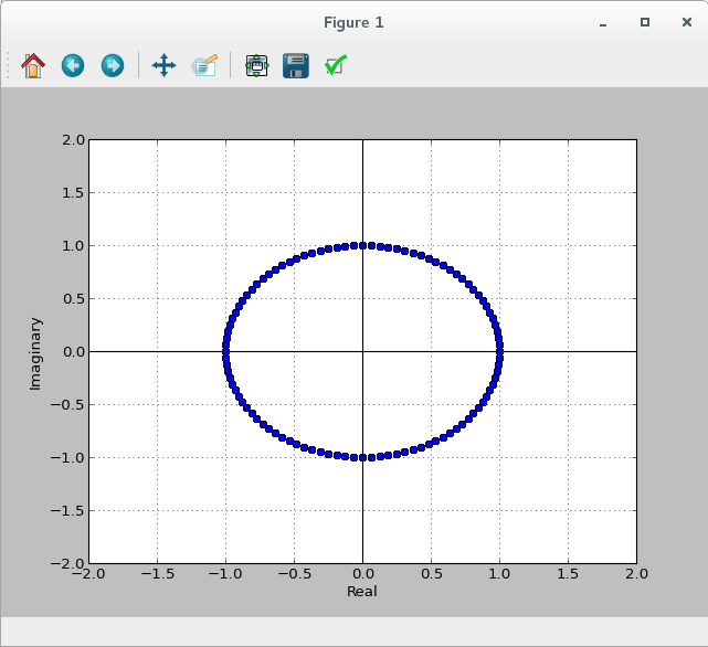
X/Y Plot
The XYPlot plot displays a series of complex samples as points on a two-dimensional plane. The real and imaginary components of a given sample are mapped to the point’s X and Y coordinates. This plot type is designed for viewing signal constellations, though it may be useful for other purposes.
By default, the plot is centered at the origin, and both the X and Y ranges are [-1, 1]. The minimum and maximum X and Y values may be set at creation time or changed dynamically with any combination of the xmin, xmax, ymin and ymax attributes:
>>> plot = sb.XYPlot(xmin=-2.0, xmax=2.0)
>>> plot.ymin, plot.ymax = -2.0, 2.0